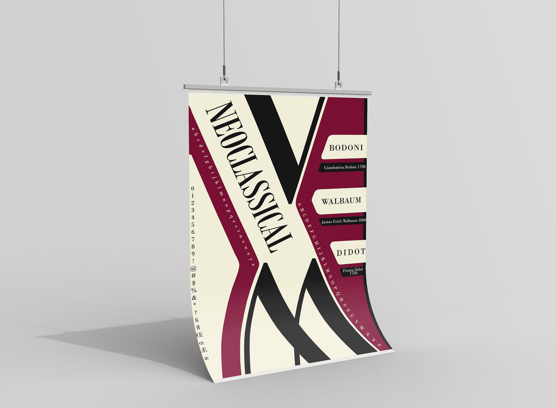
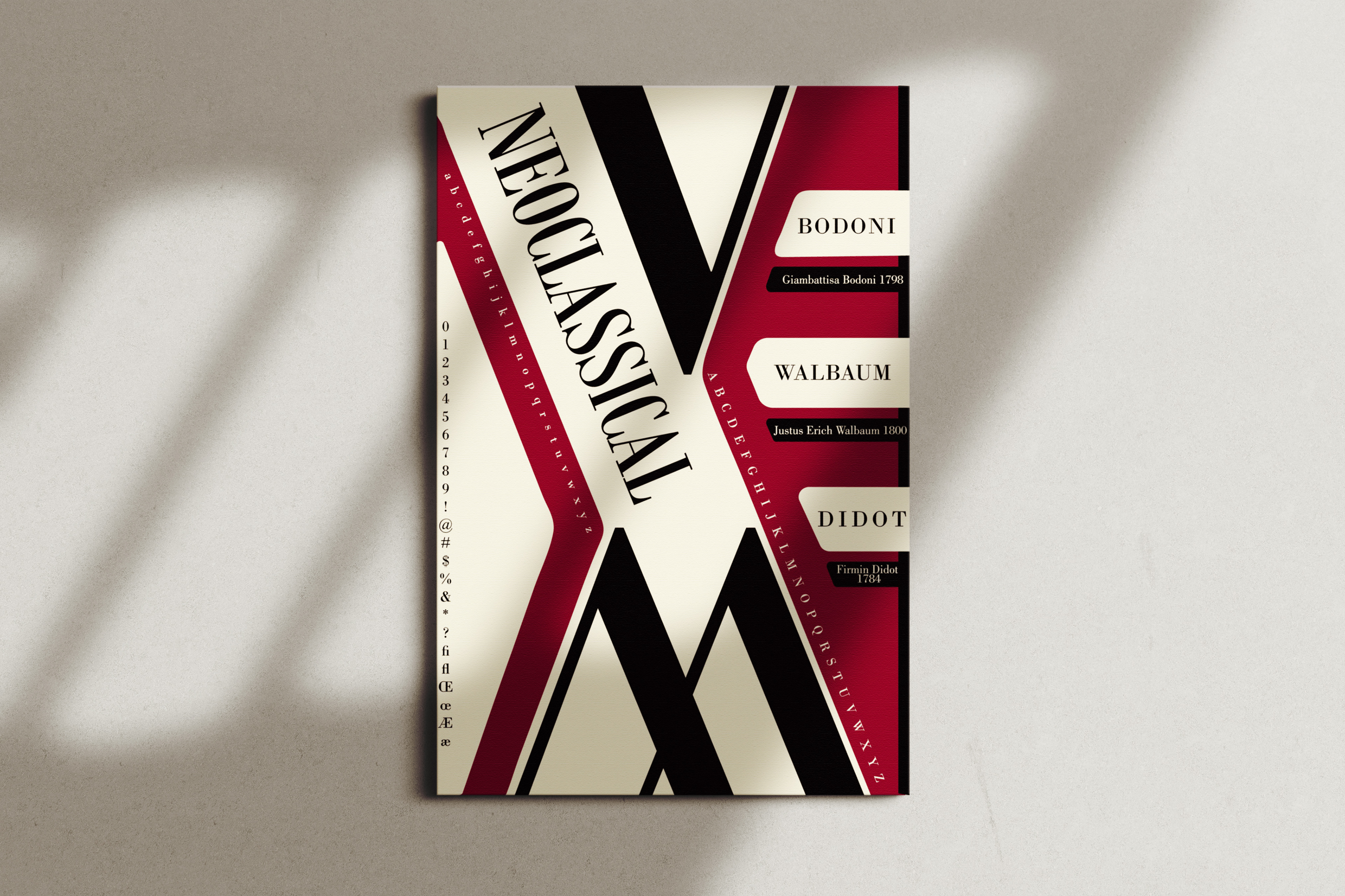
Poster design inspired by the Neoclassical period of graphic design, focusing on typography, color, and visual elements characteristic of the era.
Role:
Sole Designer
Goal
The goal of this project was to design a poster that captures the essence of the Neoclassical period in graphic design. This involved using typefaces and design elements typical of the era, along with color schemes and stylistic features that reflect the refined and balanced aesthetics of Neoclassical design.
Context
This project aimed to explore various periods of graphic design. Each student was assigned a different time period to research, focusing on the key design trends, influential typefaces, and the designers behind them. The objective was to gather this historical information and use it to create a poster that authentically reflects the visual style and typographic characteristics of our assigned period.
Design
For this design, I wanted to embrace the popular geometric and angular shapes during the Neoclassical period. I focused on showcasing the angular forms of the typefaces by creating geometric shapes around the enlarged letters. I chose Bodoni, Walbaum, and Didot typefaces, which were iconic during the era. I also placed the names of these fonts on shapes that resembled piano keys, reflecting the influence of theater and classical music in the Neoclassical period. To complement the design, I used rich colors like deep red, beige, and black tones which were also common during this time.