Logo and brand guide for Partner.bio, a biotech networking company. The project focused on creating a modern, professional identity that reflects innovation and collaboration within the biotech industry.
Role:
Graphic Design Intern

Context
During the summer of 2024, I completed a branding project as a graphic design intern at Inveniv Creative Marketing Agency in Apex, NC. The project involved developing a visual identity for Partner.bio, a biotech networking company recently acquired by Inveniv's principal and founder, Aaron Mazze. My role was to create a logo and full brand system that effectively represented Partner.bio's innovative approach to the biotech industry. After multiple rounds of revisions and feedback, we finalized the logo and established a cohesive brand system, including typography, color palettes, and design guidelines, ensuring a consistent and professional visual identity for the company.
Goals
The goal was to design a logo and brand guide for Partner.bio that would stand out in the biotech industry while conveying innovation, professionalism, and scientific expertise.
Design
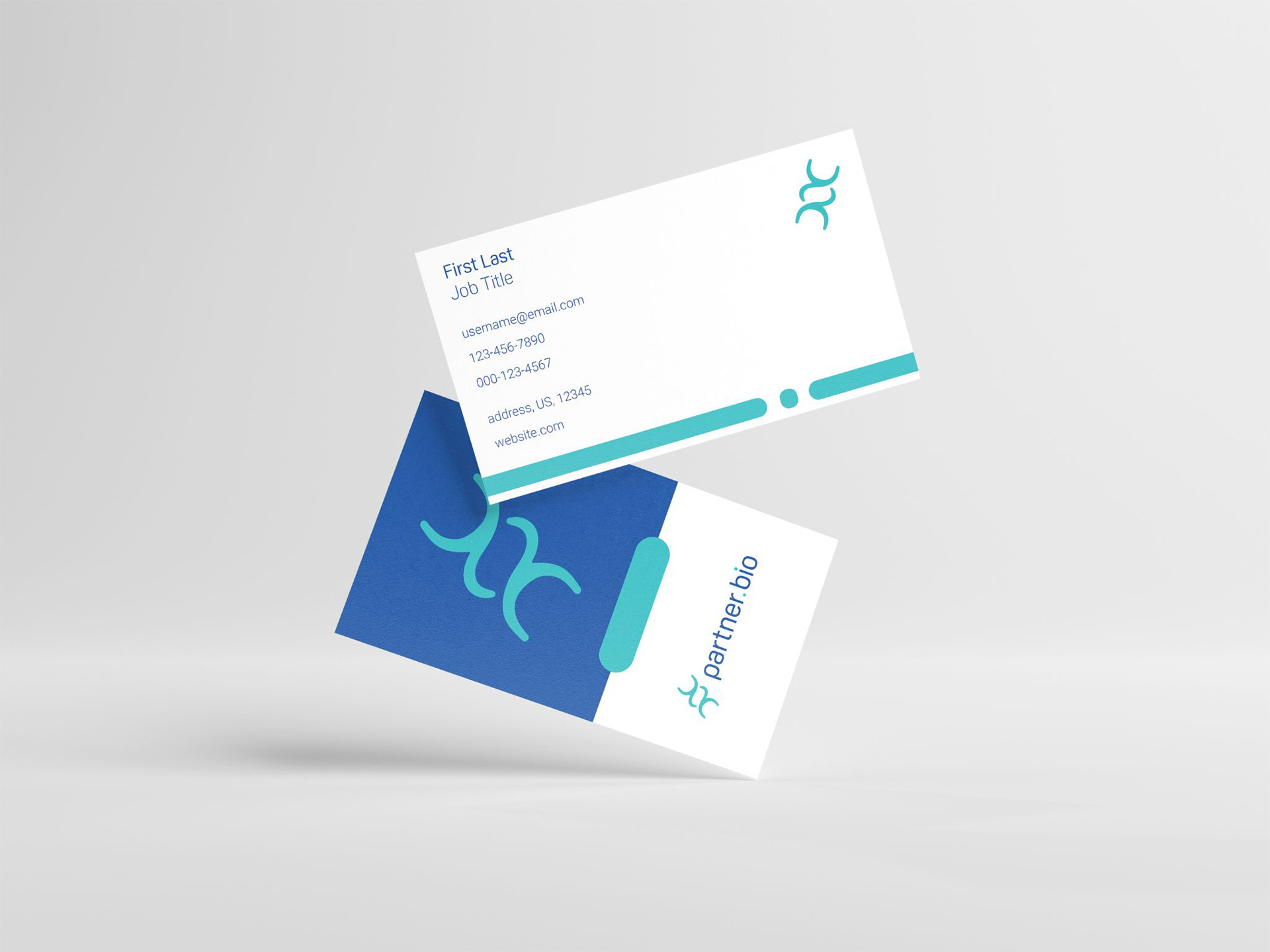
The logomark is inspired by the shape of a helix coming together, symbolizing how Partner.bio connects biotech professionals. The smooth, flowing curves represent collaboration and unity. I also wanted the typeface to match the curves of the helix, creating a cohesive look between the logo and text. The result is a modern design reflecting the brand’s focus on innovation and bringing people together in the biotech field.

Colors
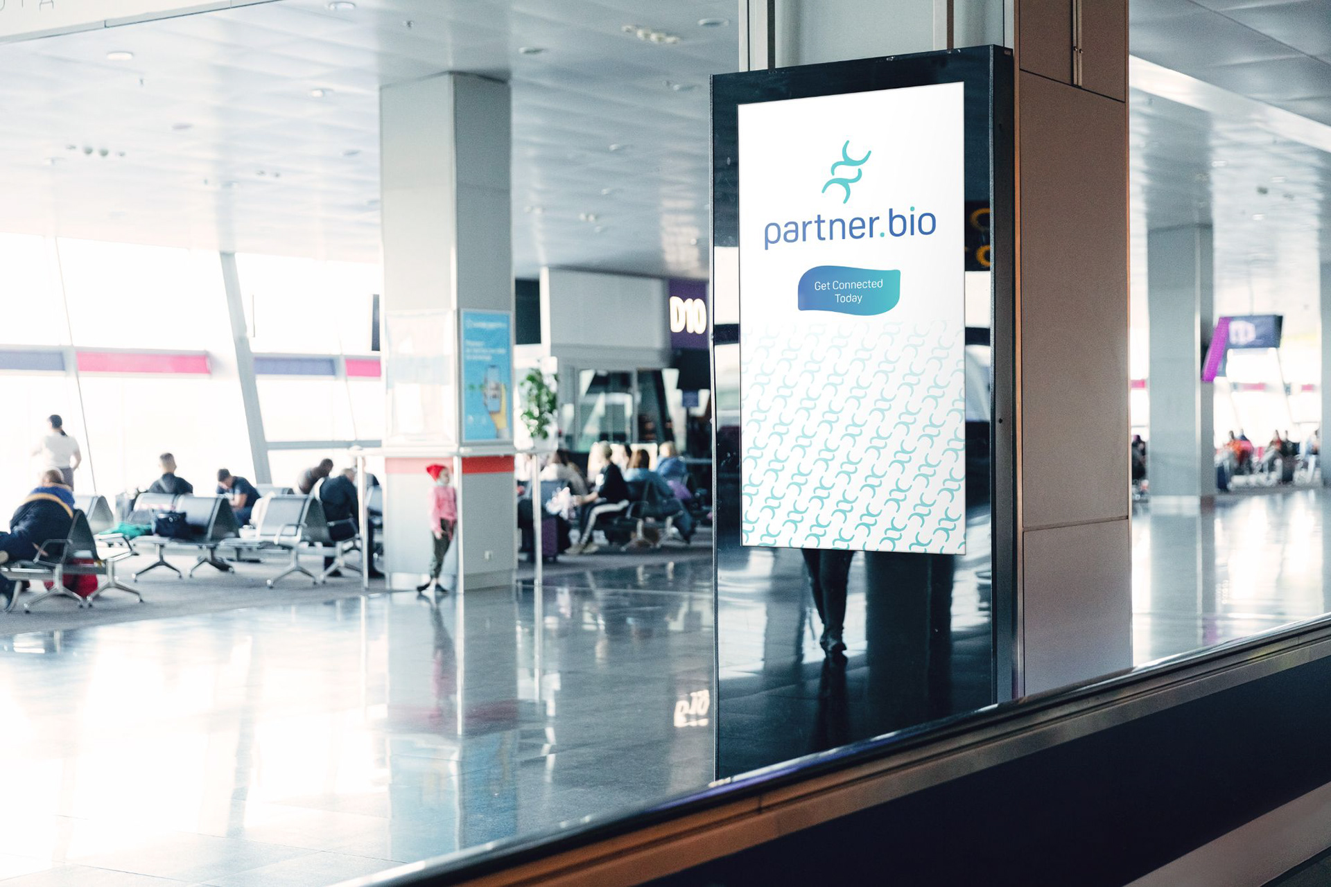
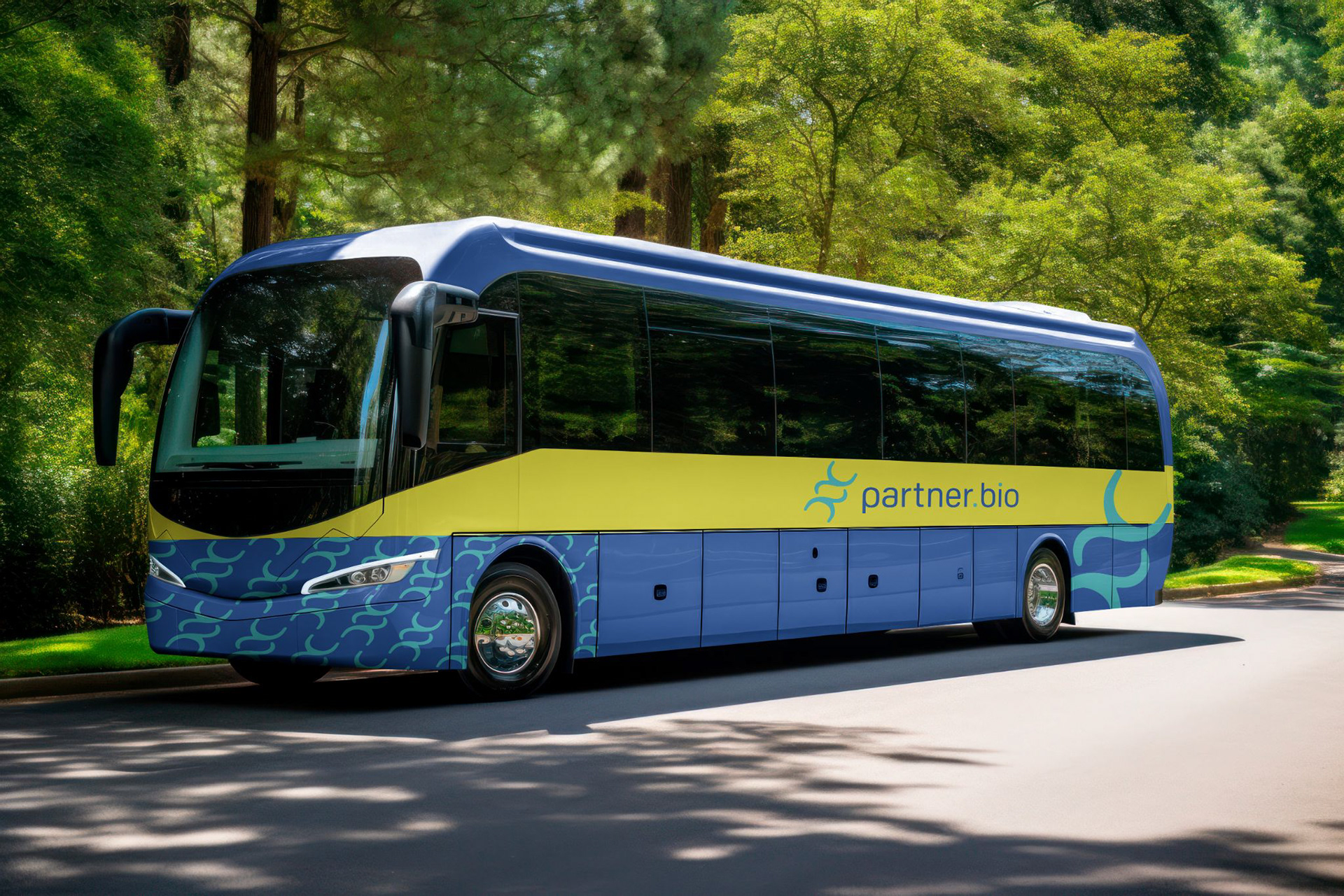
The client requested blue and green tones for the logo, so I chose a bright blue to highlight the helix and the dots in the type, creating a sense of connection. I paired it with a darker blue for contrast and balance to complement this. For secondary colors, I selected a vibrant yellow, bright green, and a deeper green to accentuate the blues, adding depth and energy to the overall design while maintaining a harmonious and professional feel.

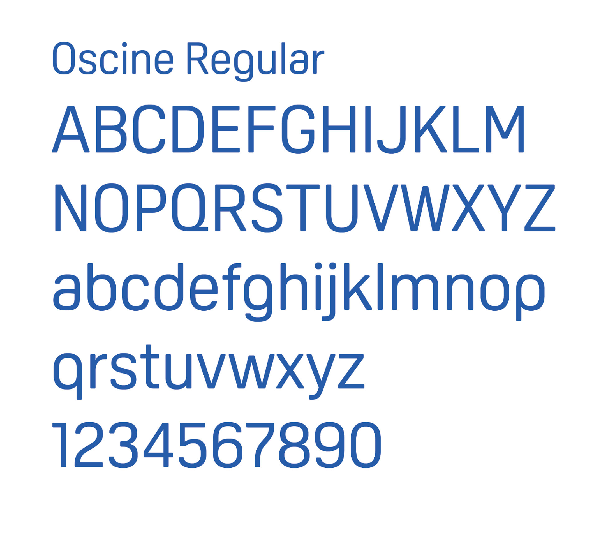
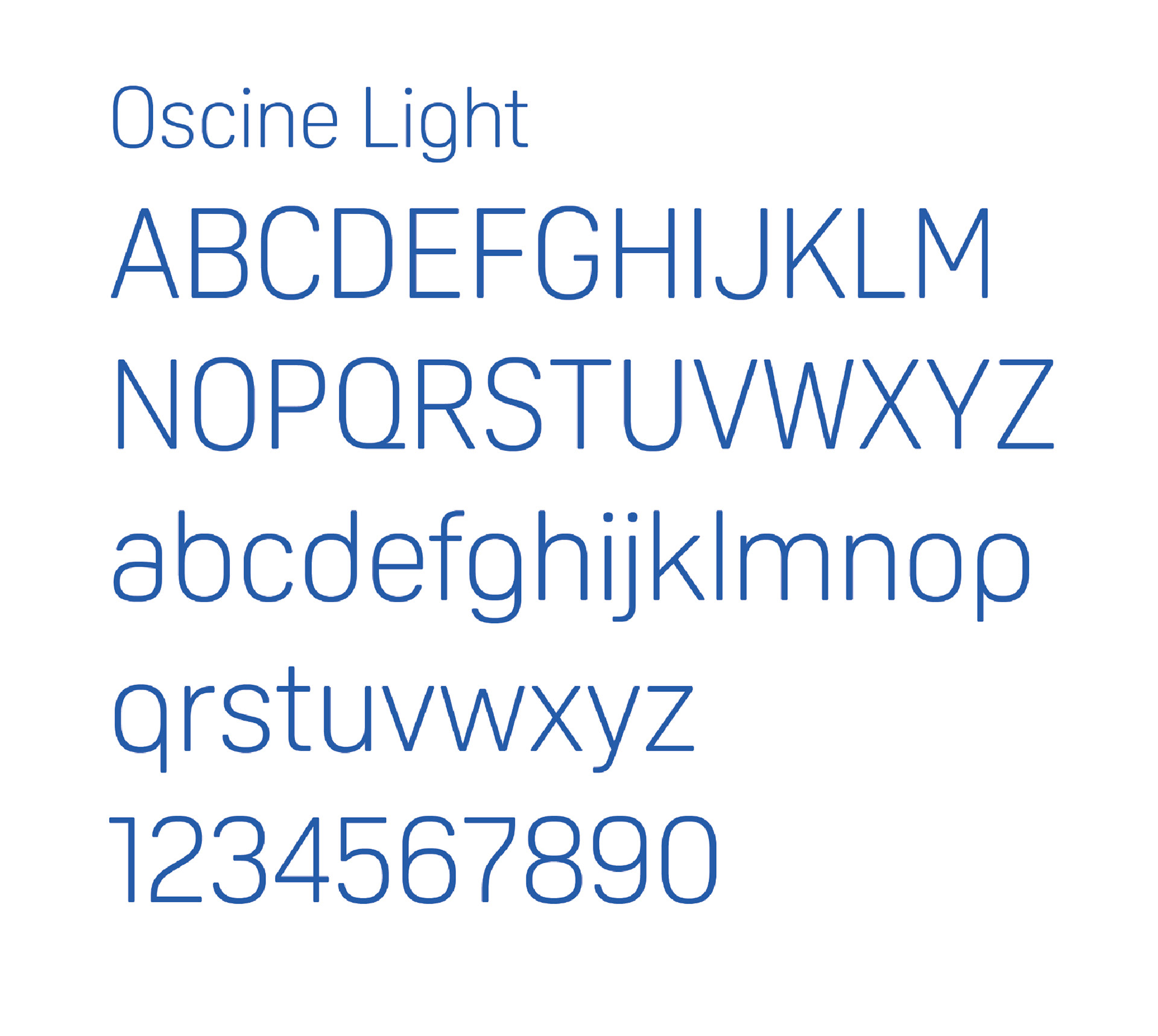
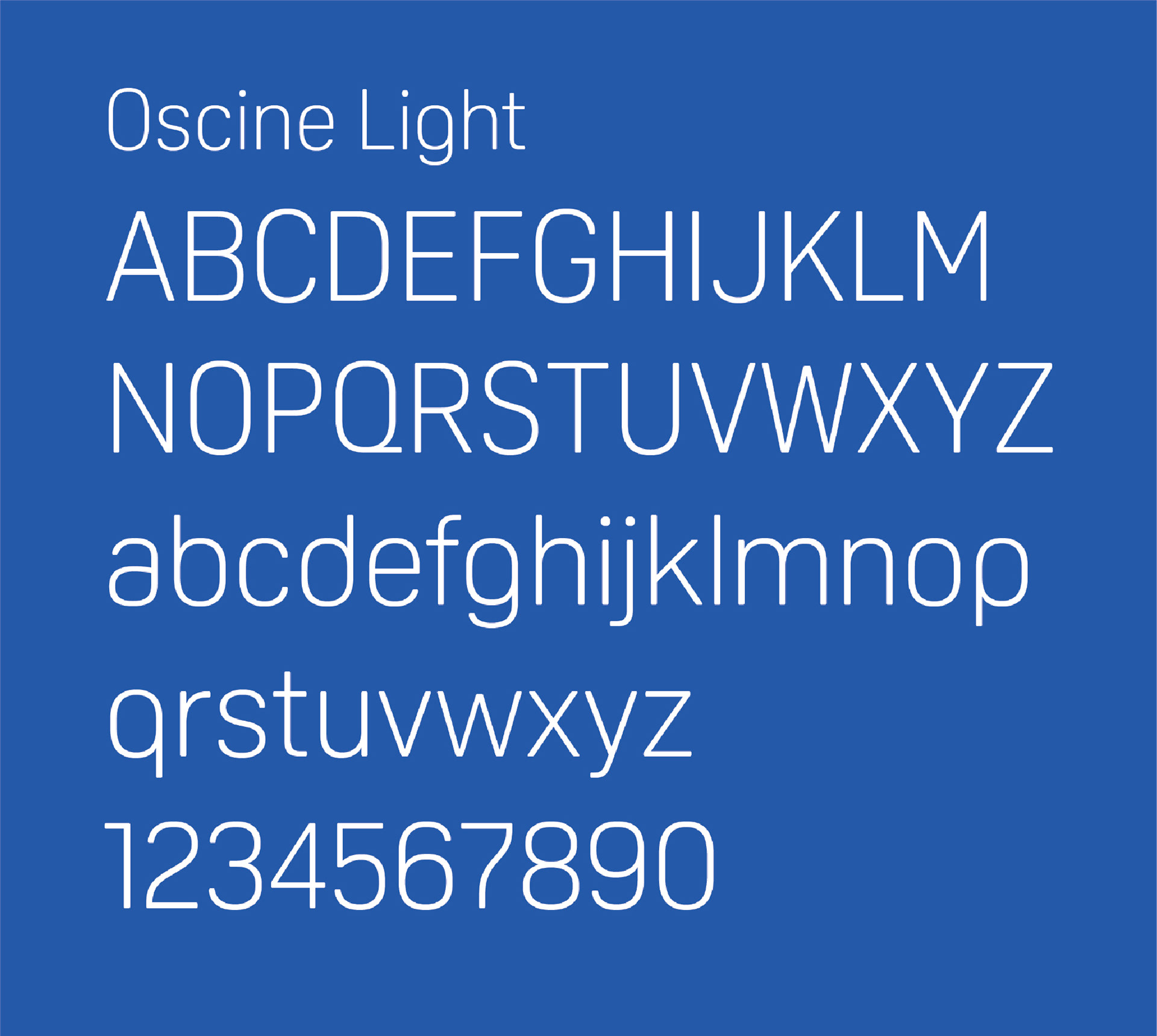
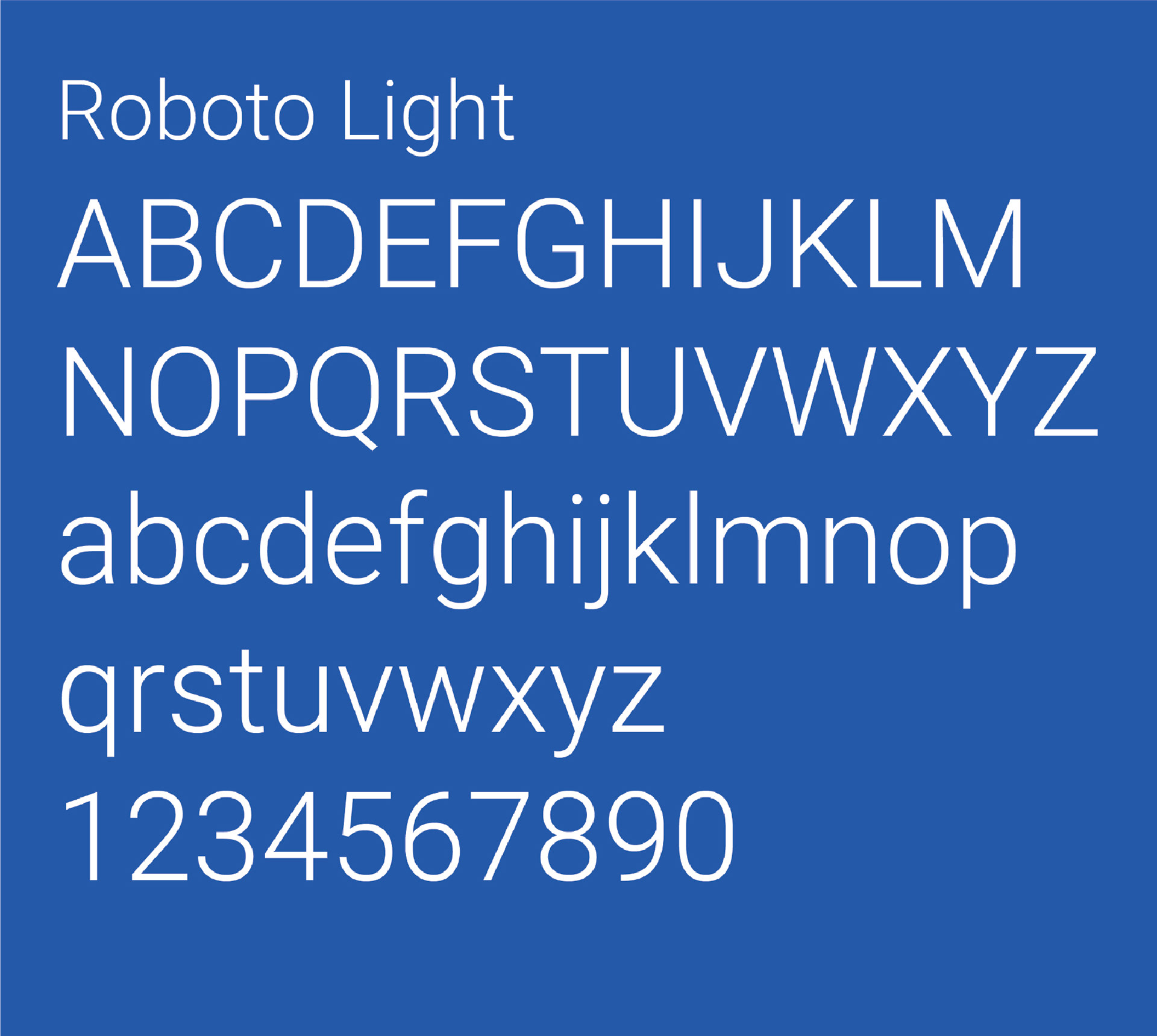
Type
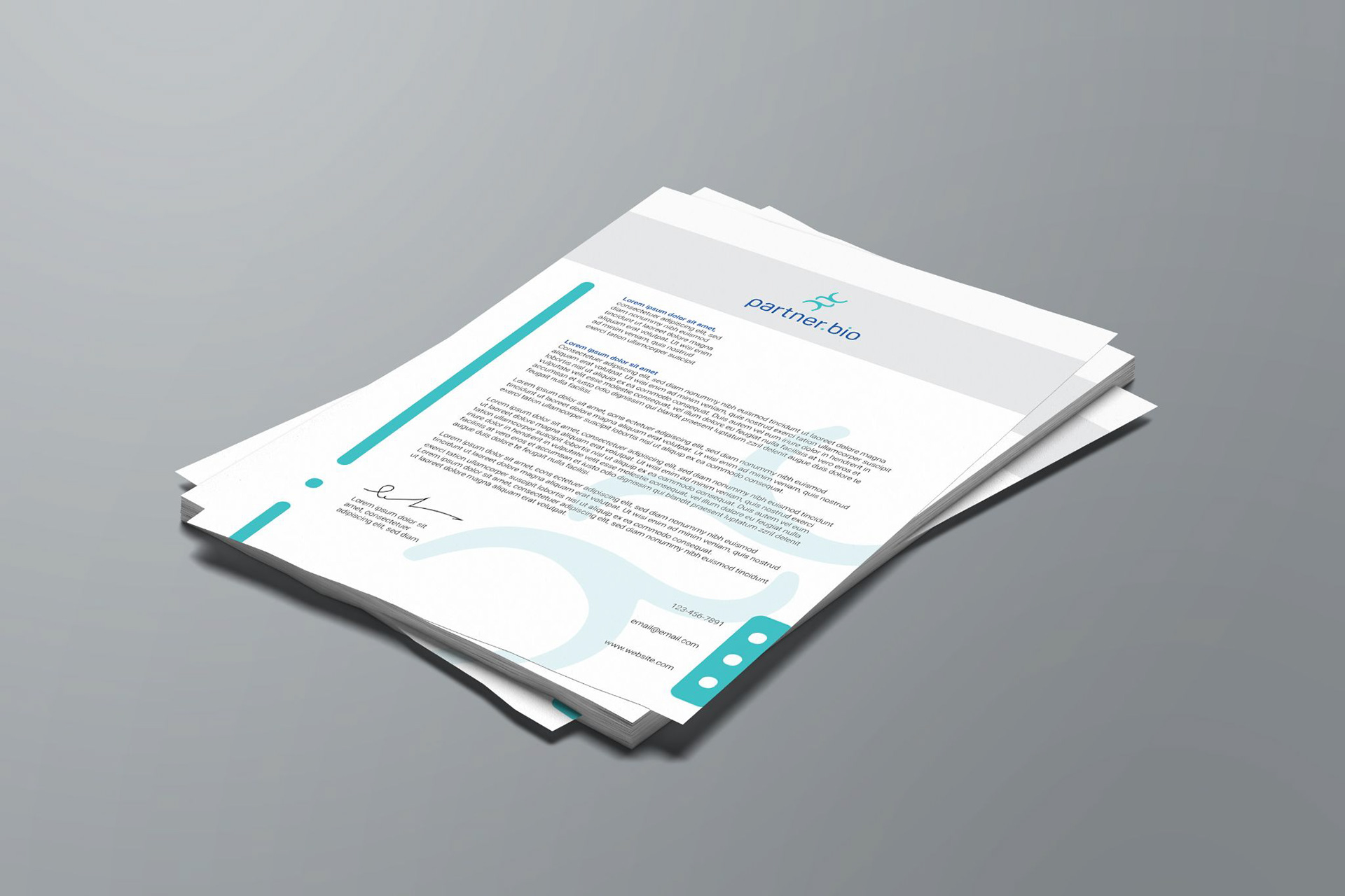
For the main logotype, I chose a font that matches the smooth, flowing shapes of the logomark to keep everything cohesive. For the subline, I used a lighter version of the logotype to maintain consistency while offering a subtle contrast. For the body text, I picked a clean, easy-to-read font that fits well with the header and subline, ensuring the overall typography is balanced and clear across different uses.


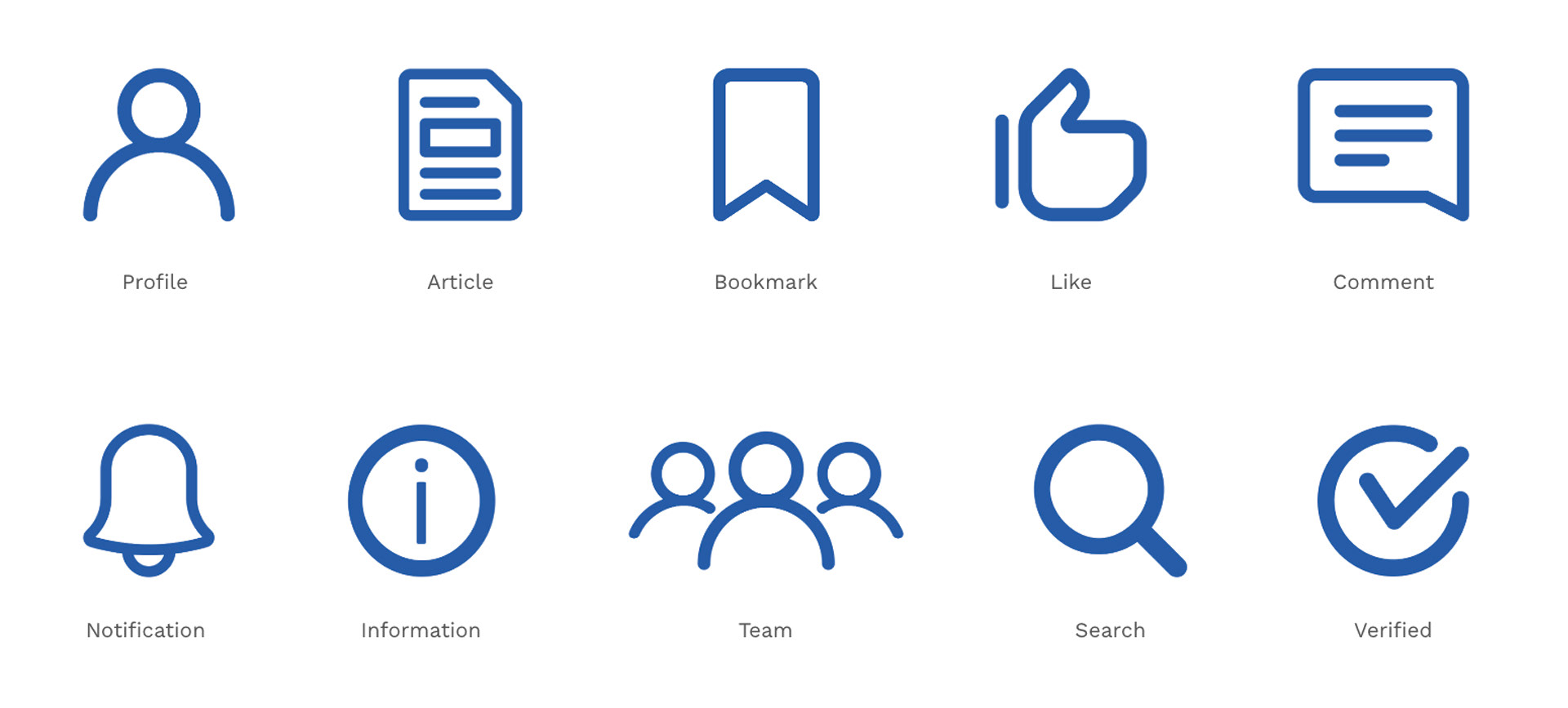
Iconography and Key Art
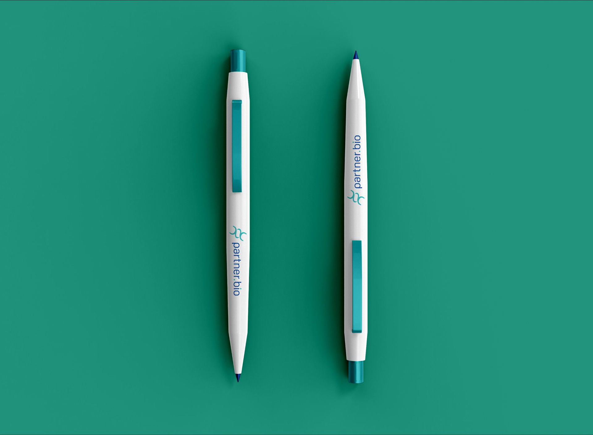
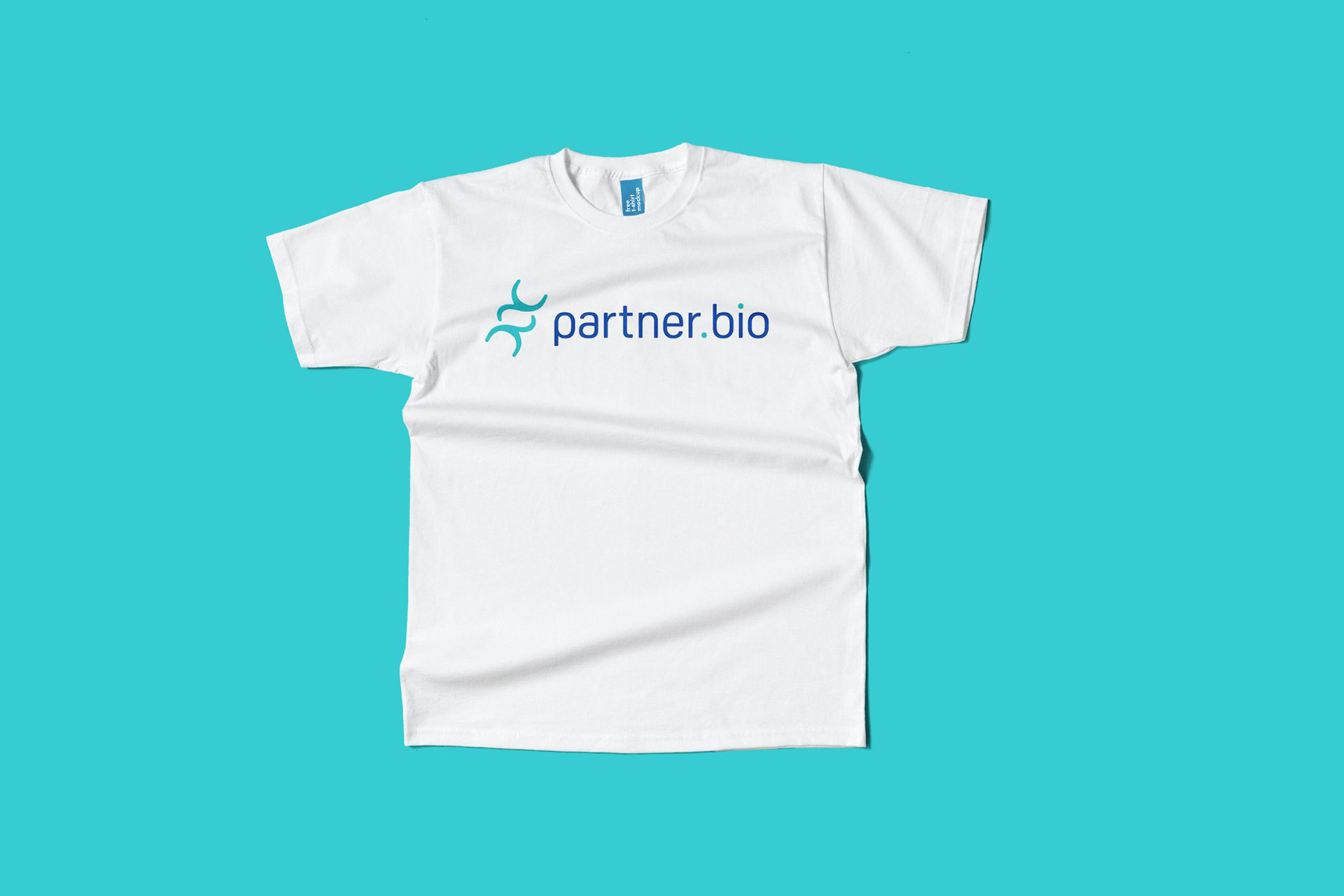
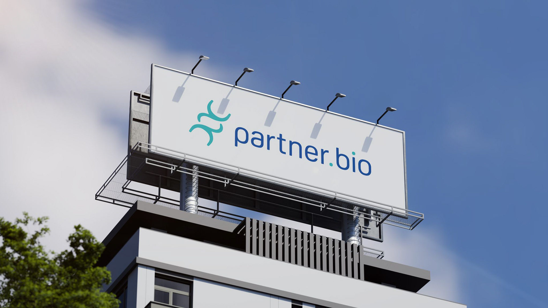
The icons are designed with simple, recognizable shapes for quick recognition in the networking world. The key art pattern, created by repeating the logomark, forms a connected design that visually represents the idea of networking and collaboration.


Usage