Package redesign for the classic board game Tiddlywinks to appeal to an older audience.
Role:
Sole Designer
Goal
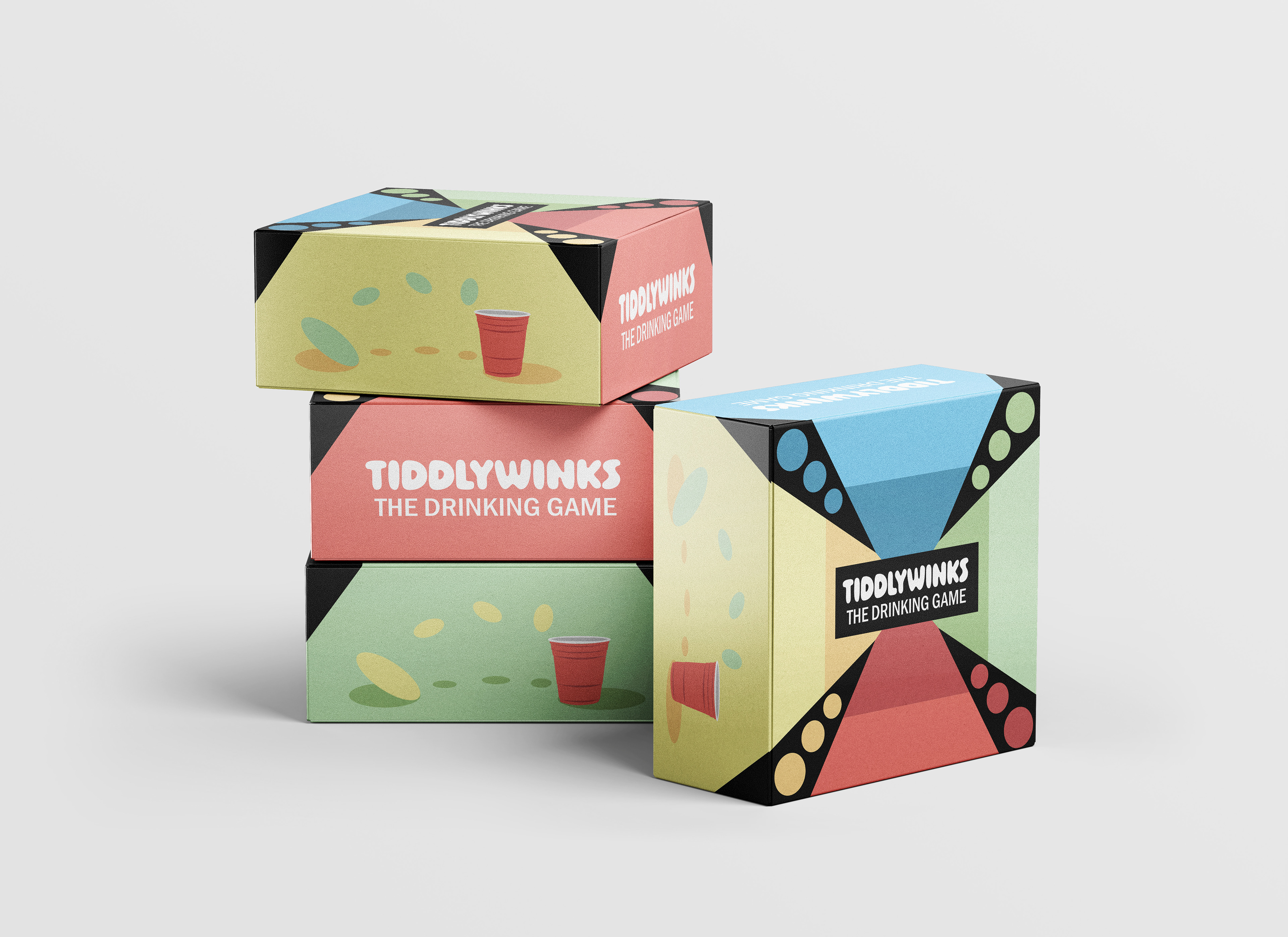
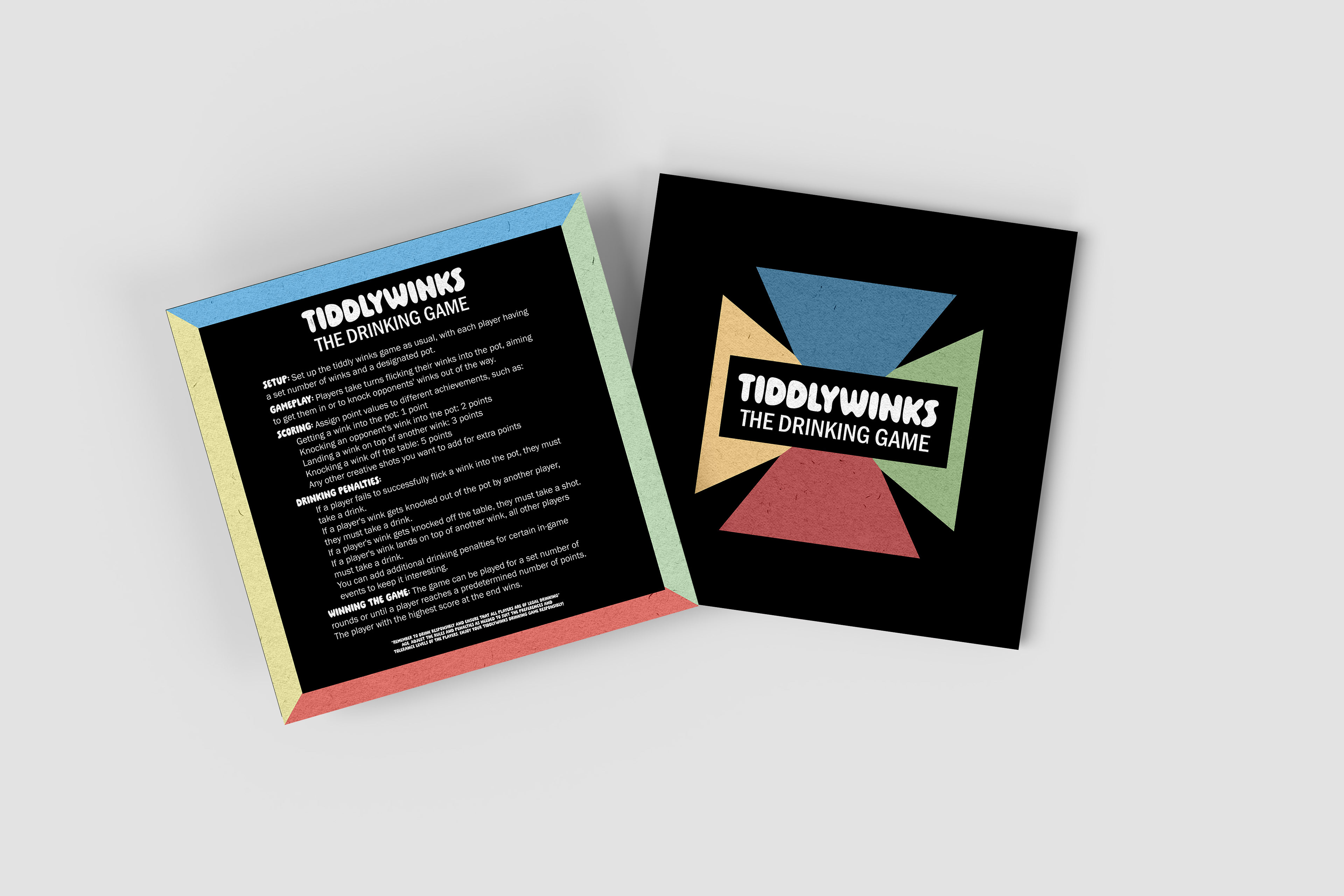
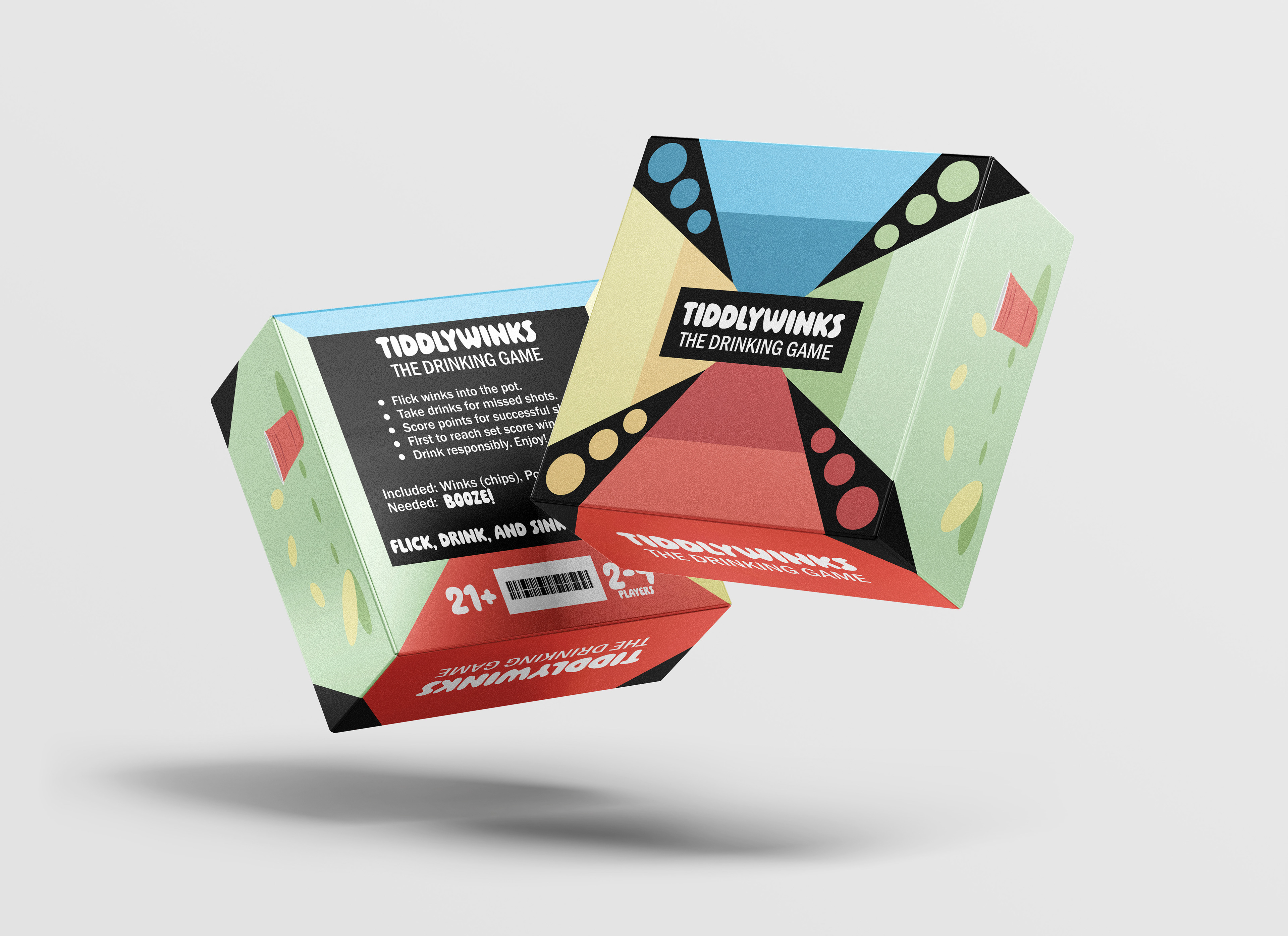
The goal was to redesign the Tiddlywinks packaging to appeal to an older audience by reimagining it as a drinking game. I kept fun, nostalgic elements to the design, capturing the playful essence of the original game while giving it a mature twist, allowing adults to reconnect with a childhood favorite in a new, entertaining way.
Context
This project, assigned in a graphic design class, involved redesigning and repackaging a childhood game from a different country. I was given Tiddlywinks from the UK, and the task was to reimagine the game for a new audience. My approach was to update the design and branding, giving it a fresh, contemporary appeal while retaining nostalgic elements that would resonate with the target demographic.
Design
For the design, I chose a playful font for "Tiddlywinks" to capture the game’s fun essence, while using a more rigid font for "Drinking Game" to add a mature touch. I maintained the original color scheme of red, yellow, green, and blue to evoke nostalgia and highlight the game's four-player nature. The package features a red solo cup as a subtle design element, with chips placed in various areas to show their movement toward the center. On two sides of the box, I included illustrative designs of the "winks" being flicked into the cup, adding a dynamic, playful feel to the packaging.