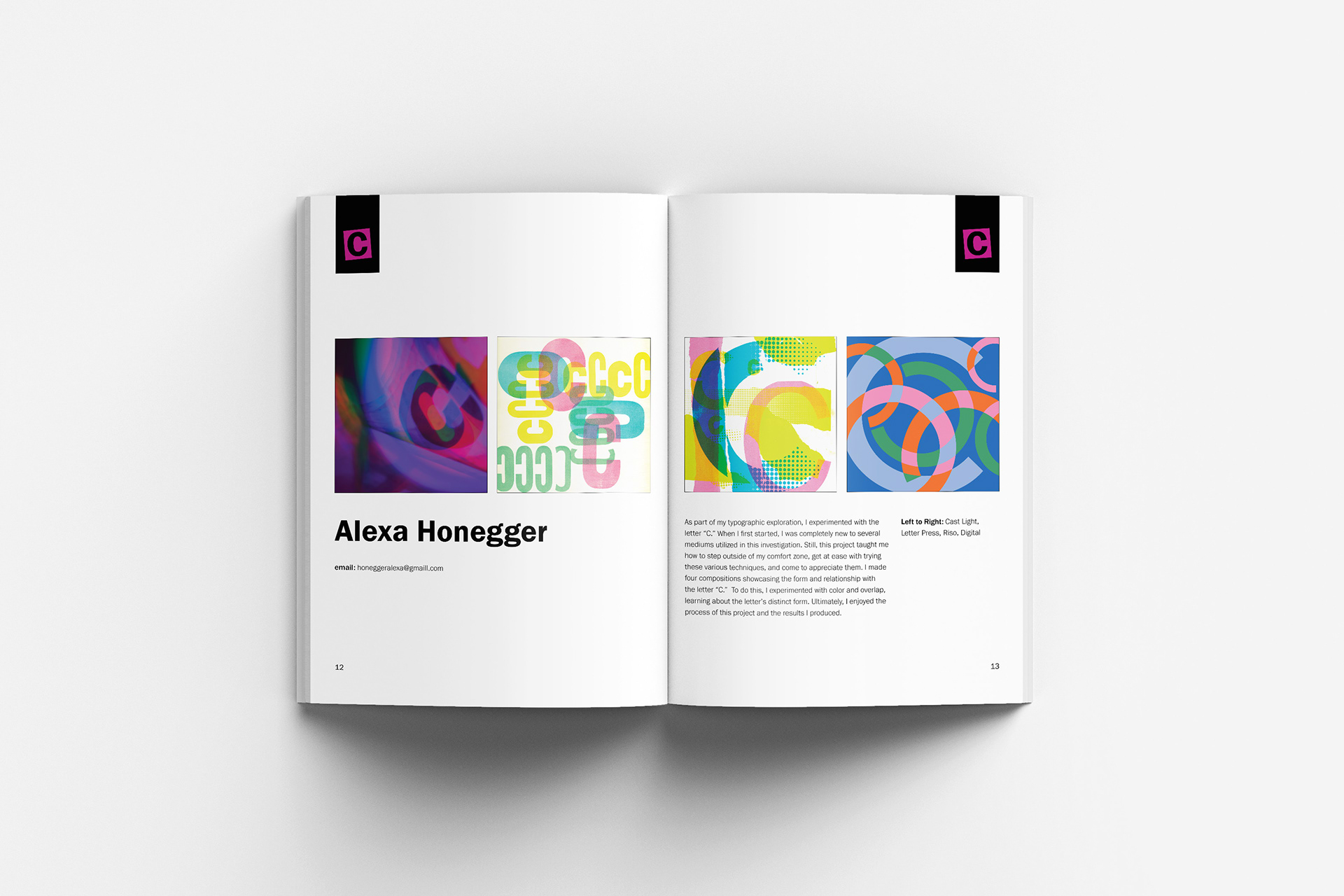
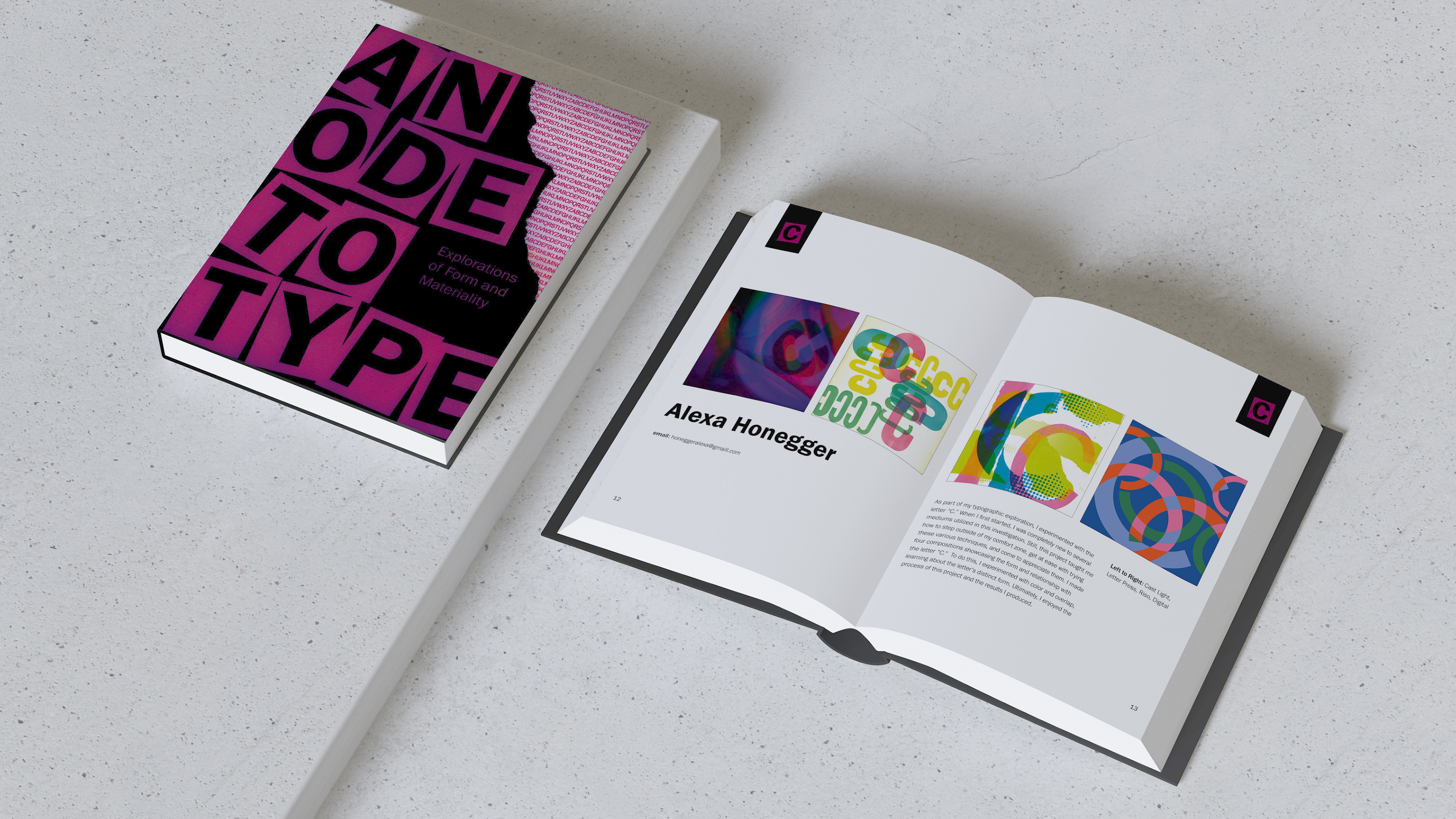
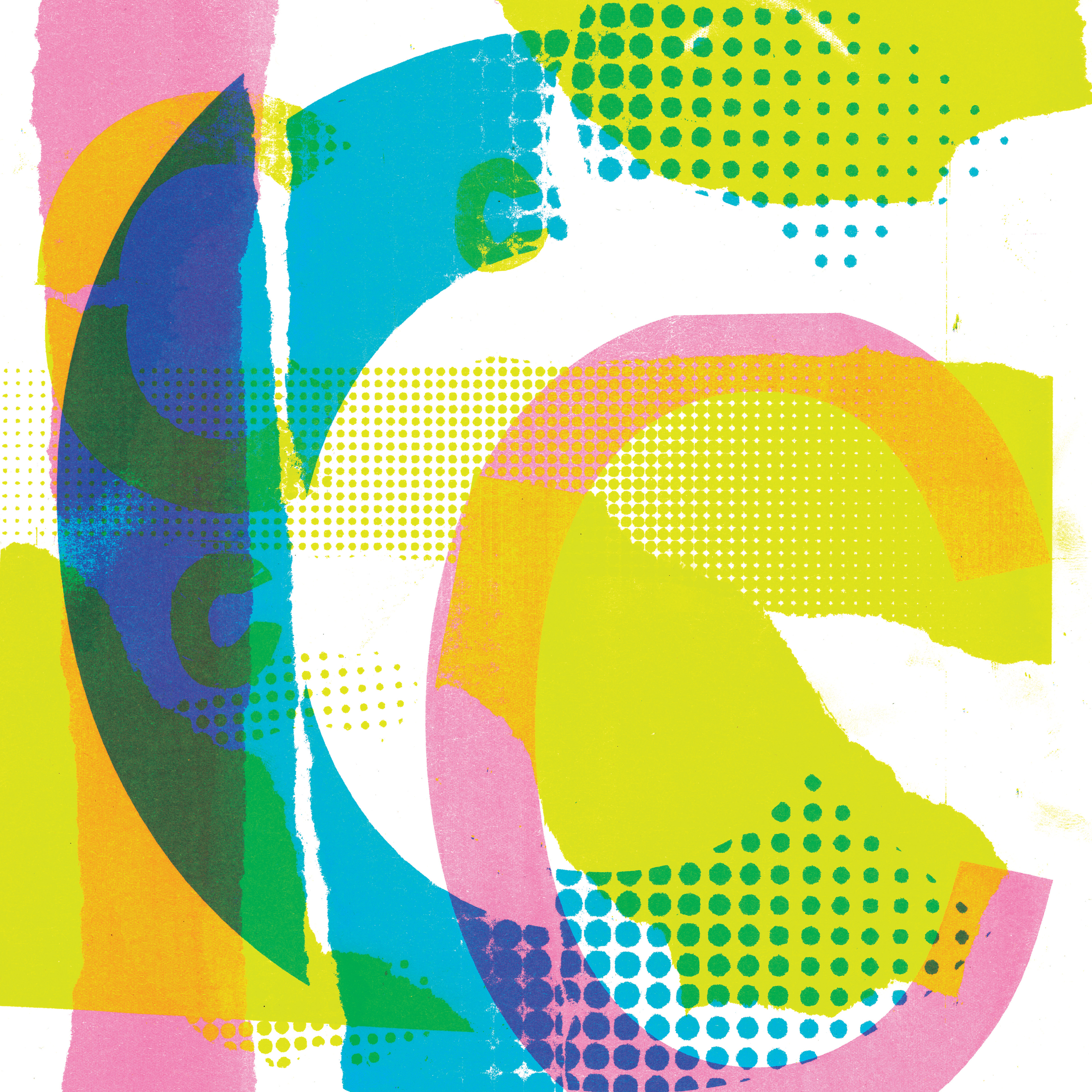
Explore the letter we were given through different mediums using cast light, letterpress, riso printer, and digitally. Then designed a book cover and layout of pages within the book using my exploration of the letter 'C' and students' work containing their letter and exploration work.
Role:
Sole Designer
Context
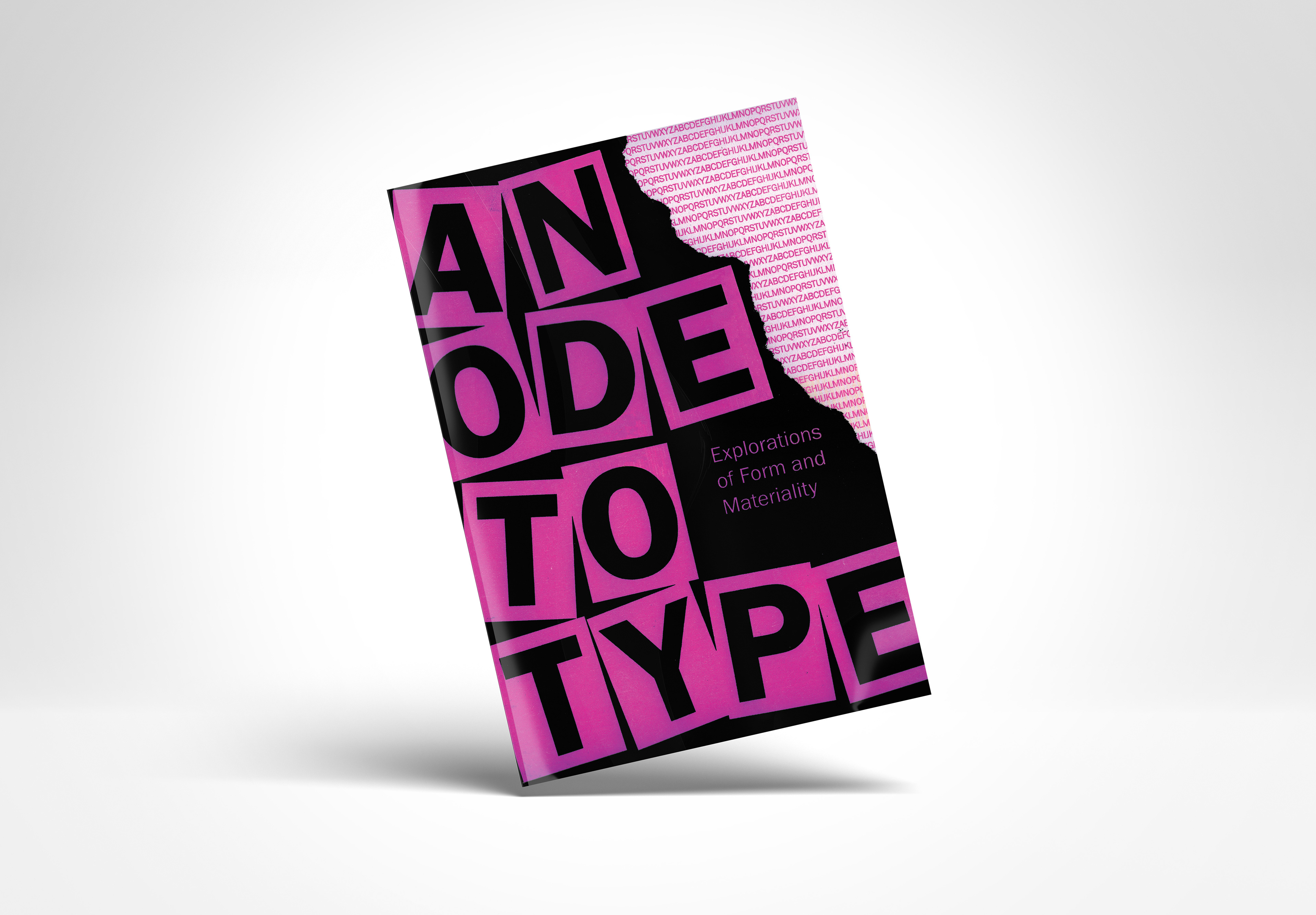
This project explores the letter 'C' through various mediums, including cast light, letterpress, riso printing, and digital design. I experimented with each method to capture the unique textures, colors, and dynamics they offer, resulting in a diverse range of interpretations of the letterform. The project culminates in a book that I designed that showcases both my personal exploration and my classmates’ works, with a carefully crafted layout that highlights the process and final outcomes.


Design
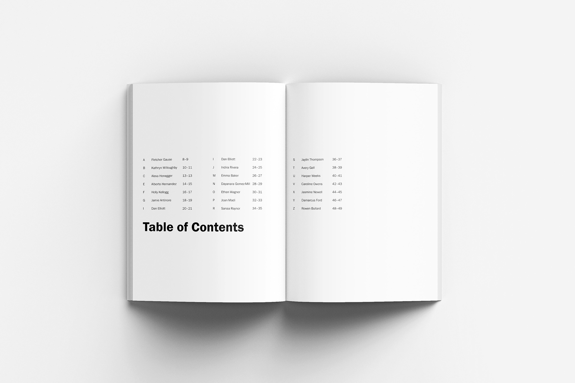
For my book design, I chose Franklin Gothic as the main typeface for its clean, bold appearance and versatility, ensuring consistency and readability throughout the book. The layout itself is minimalist yet dynamic, with ample white space to allow the work to breathe while creating a structured flow from page to page. The color palette of pink and black reflects the vibrant tones from my exploration, with pink as a focal point for emphasis. For the cover, I added an edgy touch by incorporating a ripped effect and a cut-and-paste aesthetic for the letters.